Context
Hero Energy & Engineering is a climate-focused firm developing smart-grid solutions to help energy utility managers integrate renewables and improve grid stability. Their mission is to combat climate change by advancing the adoption of distributed energy resources through proprietary, efficiency-driven technologies.
Challenge
Energy Utility Managers in Ontario struggled to monitor grid performance, access critical information, and navigate essential data due to decentralized systems and fragmented workflows. These inefficiencies created major roadblocks in balancing real-time energy demand and supply—posing a complex, high-impact problem that called for a thoughtful and innovative design solution.
My design process


What we heard from our users..


To assess user satisfaction and discover areas of opportunities, I conducted user interviews with Energy Utility managers and discovered some common themes across the board:

What the data showed..
I collaborated with the Data & Analytics team to gather, study and interpret all relevant quantitative insights:


Identifying & Prioritizing Data


User flows
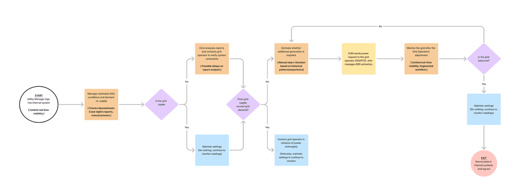
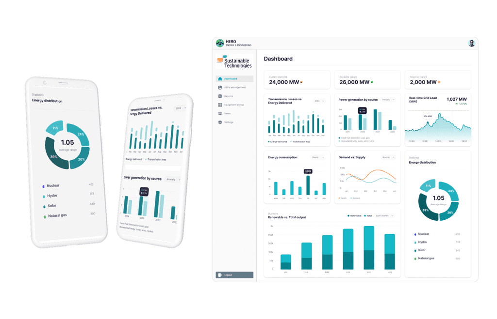
BEFORE — Manual data gathering, delayed analysis, and fragmented workflows made it difficult for utility managers to respond quickly to grid instability.
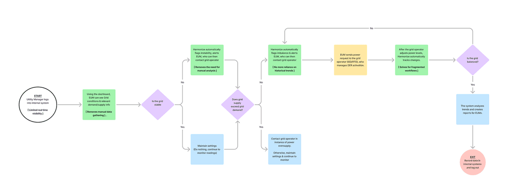
AFTER — Opportunity for a smart dashboard automated data visibility and analysis, enabling real-time decision-making and seamless coordination with grid operators.


Measuring success (KPIs)


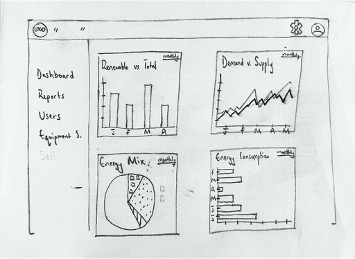
Rapid wireframing
Concept testing
Next, I evolved my sketches into lo-fidelity designs for quick concept testing. I conducted A/B testing with 4 end-users to determine which solutions resonated better and understand the reasons behind user preferences.


Results
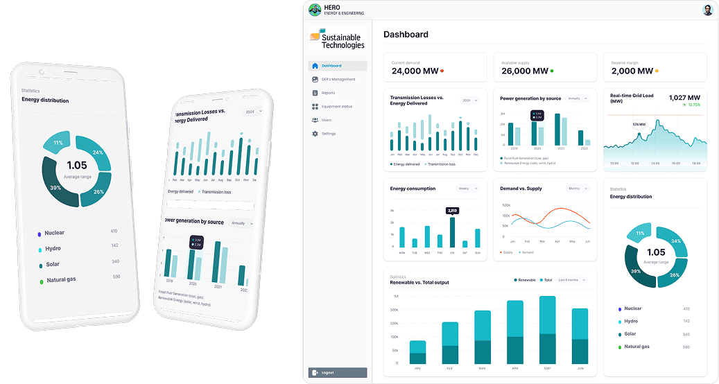
VERSION A
✅
Users were able to easily track renewable power output as a percentage/fraction of total power output. Helpful to track against goals/targets
✅
Users stated that all graphs/charts were easy to read. They could pull key info without issue.
❌
VERSION B
❌
✅
✅
Users wanted a clean display on power demand/supply info, and appreciated a number on top of the charts/graphs. Helped to outline power reserve margins.
Dev feasibility checks
Collaborated with developers for feasibility checks, ensuring designs were technically viable and minimizing implementation delays.


Reflections & learnings
What went well
Cross-Team Collaboration:
Involving EUM’s AND Grid Operators early in the design process helped identify key usability gaps and ensured the dashboard met real-world needs.
Research & Data-driven solutions:
Leveraging quantitative data and user interviews, I created evidence-backed design solutions, building team trust and stakeholder confidence.
What could I have done better
Calling out new components to devs:
FE developers were confused by new components in Figma that weren't in Atlas, unaware they needed to be built before reuse.
How I fixed this:
Calling out new components to devs:
FE developers were confused by new components in Figma that weren't in Atlas, unaware they needed to be built before reuse.